Monday, July 18, 2011

And when they say 10,000, they mean it.

When I was in college, I studied abroad in Hong Kong. I stayed there for five months, and it was a really wonderful time in my life. When my brother said that he could get me a layover in the city on my way to Beijing, I jumped at the chance.

One of the things I wanted to do was go to the 10,000 Buddha's monastery, because even though I had gone when I studied abroad there, I didn't take any pictures, and I remembered it being a very interesting place.


I remembered right! In the West, I think we are pretty used to seeing Buddha look something like this.


But, when you've got 10,000 of them, it pays to diversify.


The monastery was full of statues like this. Near life-size and painted in gold.

There was Buddha holding stuff.


Buddha after you barged into his dressing room.


Buddha crossing a river without getting his pants wet.


Buddha who can reach stuff on the top shelf.


Buddha who, um, well...


They weren't all life size statues though. They crammed a lot into a main hall.


There is actually something like 12,000 Buddhas in the whole compound, and I'd believe it. It was totally worth the 400 steps there, and the dozens of mosquito bites I got.

Saturday, July 16, 2011

Inspector Body

When I was a kid, we had a book called Inspector Body. It was about how your body fights infections and sickness with the help of a small guy that lived in your brain and told everything what to do. I must be remembering the name wrong, because I'm having no success googling it for more information.

I bring it up, because it had a very particular color palette. I'm not normally a fan of purples and pinks, but in certain combos, it can really work for me.

When the third Project Modern theme was announced with the theme of "Organic", my immediate thought was, "well, gonna sit this one out!". The word organic has a lot of associations, but for me personally, it takes me right back to design school. Our classes were really small, and always with the same people, and after a while, critiques started to take on similar tones. There was one student in class who used the word "organic" to describe people's work all the time, whether the term applied or not. As time went on, it was a word we started using when we didn't know what to say about somebody's piece. Sort of mediocre piece that could go either way? Organic. Bad piece that nobody wants to call out? Organic. Piece that somebody is obviously very proud of but kind of sucks? Organic!

In short, when I hear the word organic, my first though is usually, bullshit.

This is, of course, a view colored by my own experiences with the word. In truth it means a lot of wonderful things.

When I thought about the challenge a little further, I decided to read definitions of the word to see if there was any inspiration there, and the first definition I read mentioned that organic can refer to organs.

As soon as I read that, I knew that I wanted to do something drawing from human organs as inspiration. I thought back to the colors of the Inspector Body book, and knew that there was potential. I decided to abstract the idea of organs into a two dimensional patchwork design.

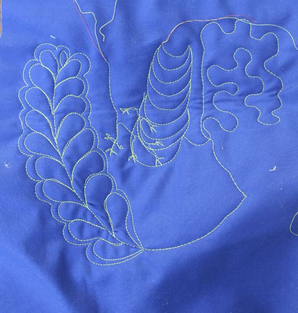
I like seeing what a really twisty, 3-D system looks like when you match it up with the demands of patchwork quilting. I think the color palette helps sell it as a body interior. I've got lungs, liver, stomach, and large and small intestines represented.


While patchwork can be very geometric, free motion quilting is more like a continuous line drawing. You can have anything, anywhere. I decided to use some traditional quilting patterns like feathers and stippling to mimic the shapes of the organs.

I've never quilted feathers before. I did a lot of drawing practice ahead of time, and then did a practice stem of feathers.


I glanced at it, and proceeded to start the feathers on the quilt itself. I got halfway through the first large intestine section I was adding the feather to, glanced back over at the sample and had a moment of panic.


What had I been thinking? The sample feather looked horrible to me at that moment. The feather I was quilting looked horrible. I had to take a break. I decided to continue on with the feathers, even if they looked awful because I really liked the idea of feathers representing the large intestine. As I kept sewing, I felt better about it.

I think it's true that the quilting isn't show worthy, but it's not awful either. I have to remind myself that things aren't always going to look perfect right away, or the first time I do them, but it's still important to keep doing it. I may or may not get better at making feathers, but I won't improve at all if I don't at least try.


At the end of it, I like the quilting quite a lot. It's not perfect, but it represents a process. I'm glad I didn't let my lack of technical skills stop me from trying to execute the vision I had when I thought of this quilt.

Thursday, July 14, 2011

Yeah, about that...

When I was in China, I took a lot of pictures that I hope to use for quilt inspiration.

Pictures like this.


Those green square posts could make kind of a cool block, but...


And this is kind of a cool repeating pattern, but...


And this could be an interesting quilting pattern, but...


And I like this style of woodwork, it could translate into a block, but...


I like the colors here, but...

I mean, it's obvious at this point. They all have swastikas in them. Some are more apparent than others, but they are all there.

Now, I know that the symbol of the swastika has been around for a long time. For thousands of years, it was a symbol of good luck, and change, especially in Asia. It's not unusual to see a lot of swastikas in motifs around China.

It would be really poor taste for me to put these patterns in a quilt though. When your first introduction to the swastika is through Hitler, it's sort of over. I don't think I could ever be comfortable showing a quilt with anything resembling a swastika, no matter what my inspiration was. I don't know if there would be a point in the European/American future that it would be acceptable. I'm guessing it's not in my lifetime.

When you are working with geometric shapes, the swastika, or the shadow of it comes up more than I thought it would. I never knew that I would have a hobby where I would have to be vigilant that my own work didn't have swastikas in it.

For example, when I was brainstorming ideas for my sampler quilt, I showed a sketch for a block to my old roommate.

It looked like this:


The conversation went something like this:

Me: Hey Corky, when you look at this, what do you see?
Corky: Um, I dunno, a pinwheel?
Me: (excited, thinking that I can get away with it) Oh really!? Just a pinwheel?
Corky: No. It's obviously a swastika.

I did a lot of research for that sampler quilt, and ran across that type of block again. It's called the "Crazy Ann". It looks like this.


And people still make quilts with this block! I mean, if you don't do it in black, it's not so obvious, and the block's origins are pre-WWII, but still, to me, it's an obvious swastika no matter what color it is.

Fortunately, I did get a lot of photos in China that I found inspiring that were swastika free.

And, at a flea market, I saw this guy.


Too bad I didn't have room in my suitcase!

Tuesday, July 12, 2011

Guess Who's Back!


Wait, wrong photo.


I'm back from China. I have a million pictures to upload but I'm taking it easy today and lazing away the jet lag by eating crackers and ready blogs.

Don't worry, I had a great time!